homes commercial archived

homes commercial archived
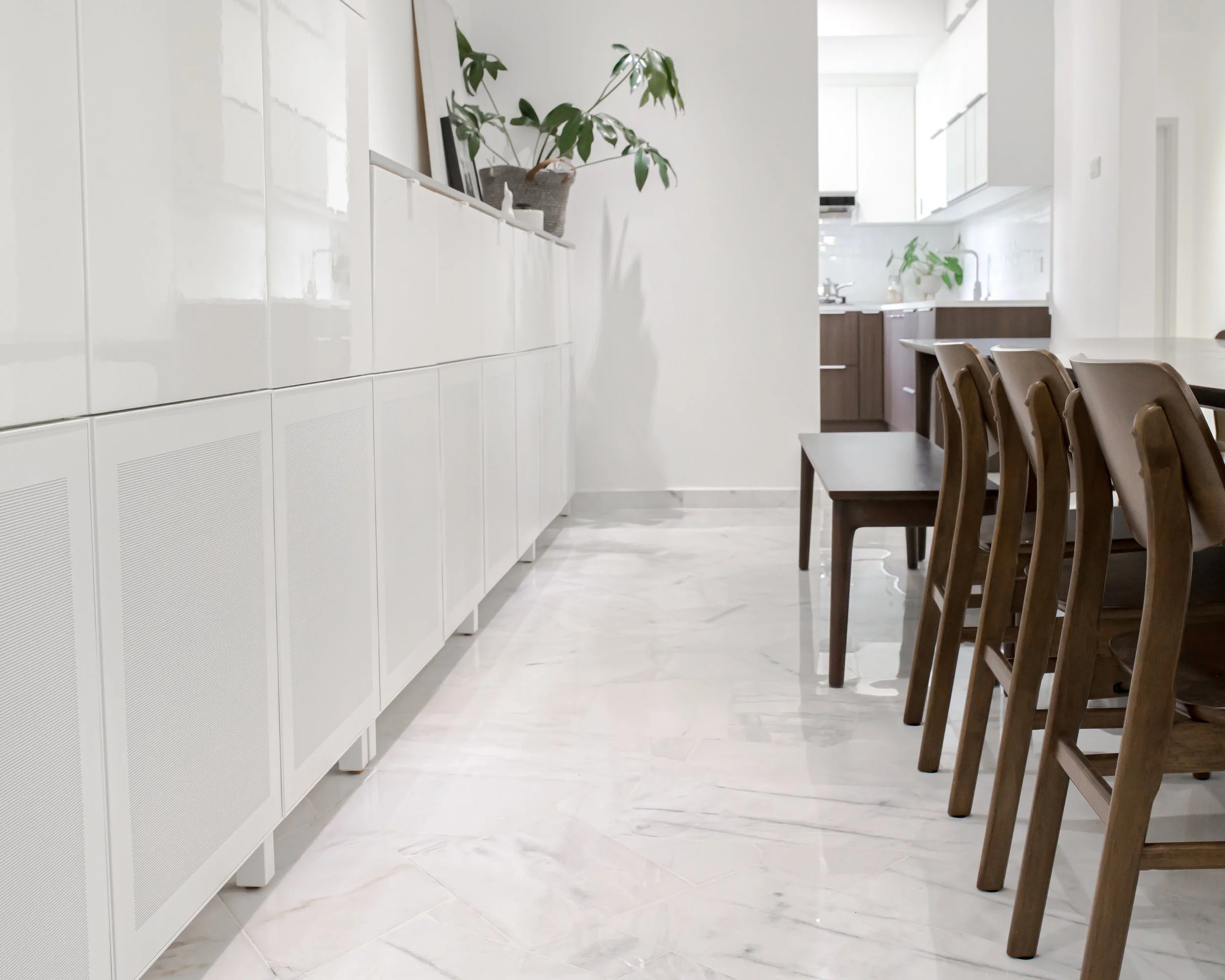
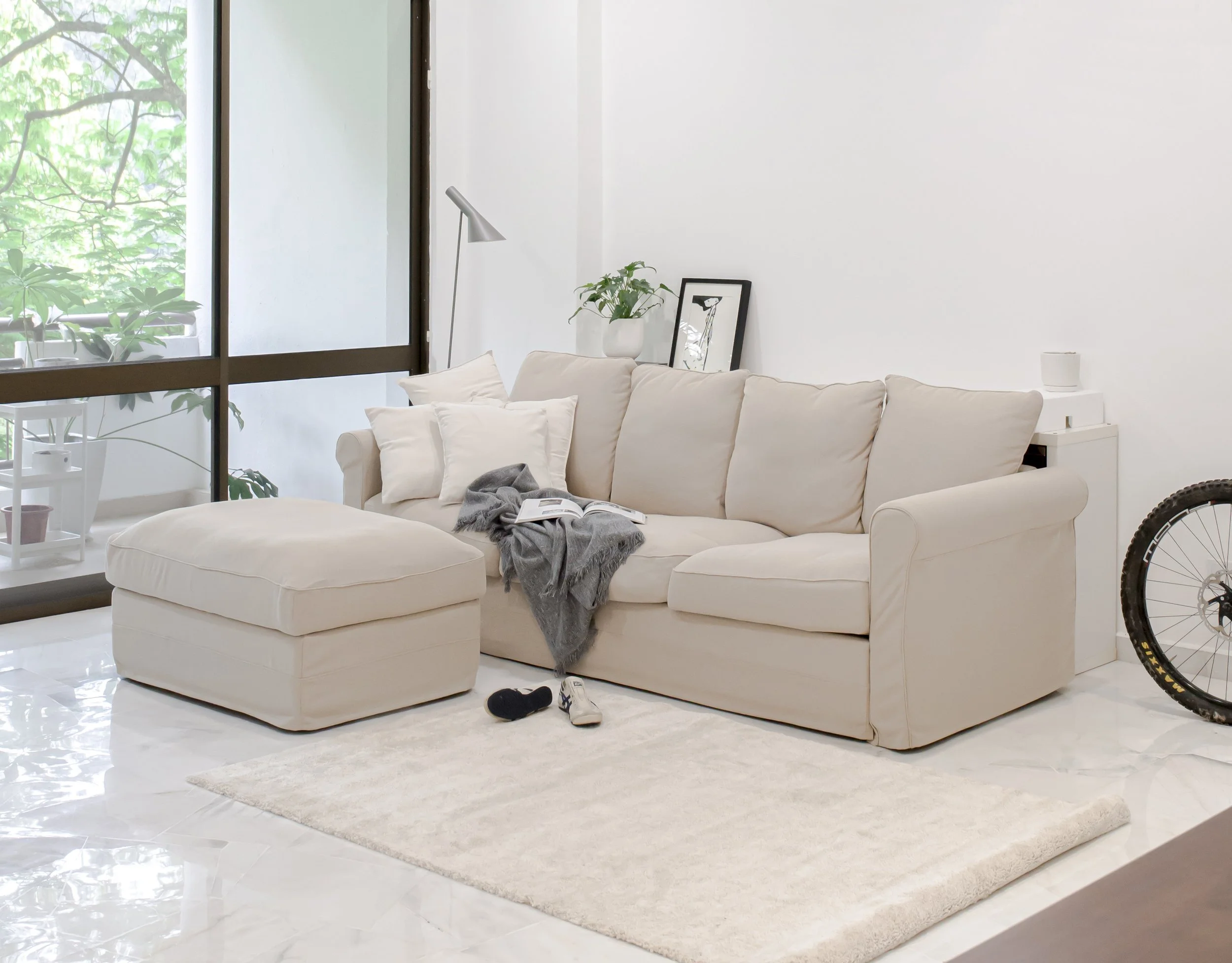
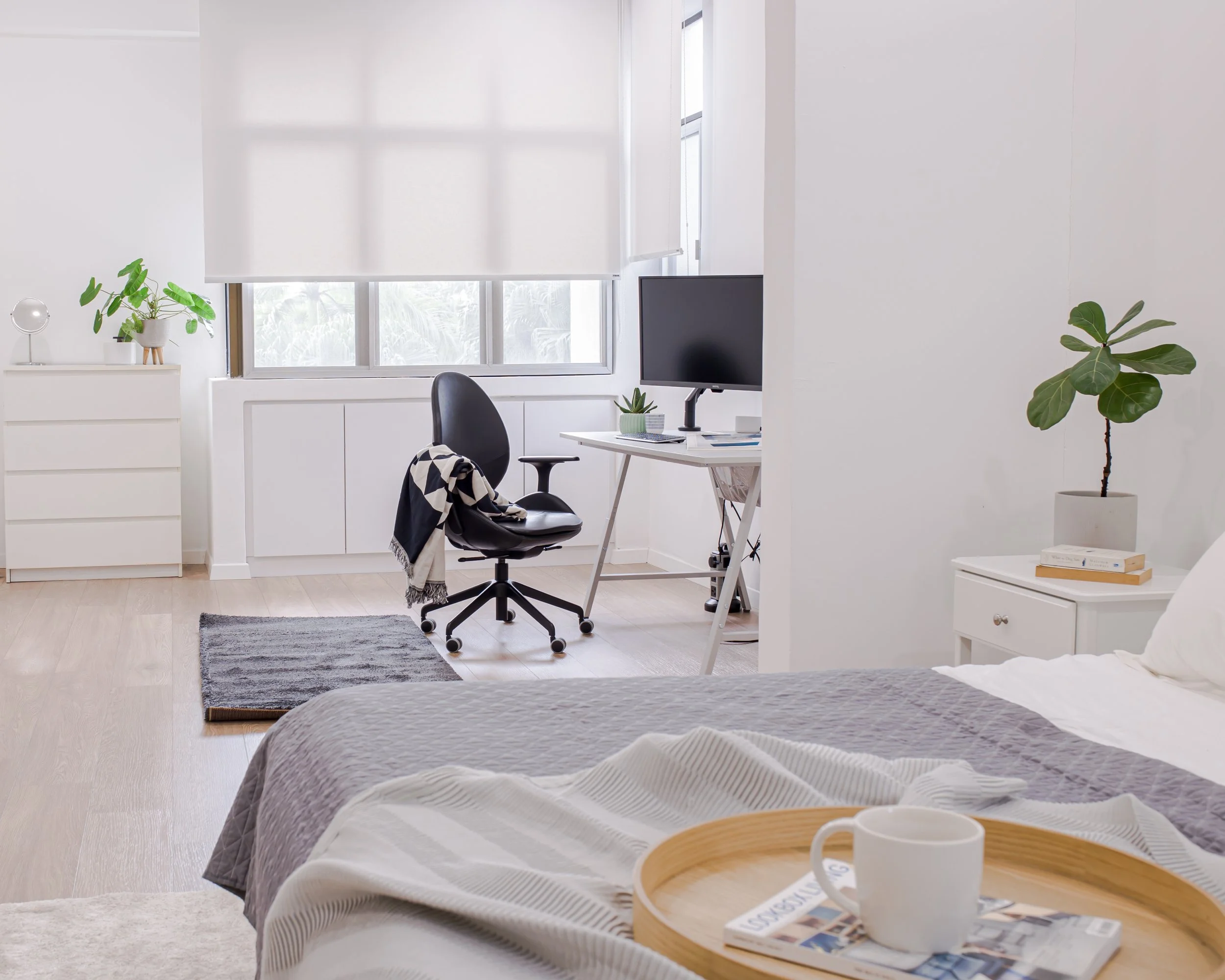
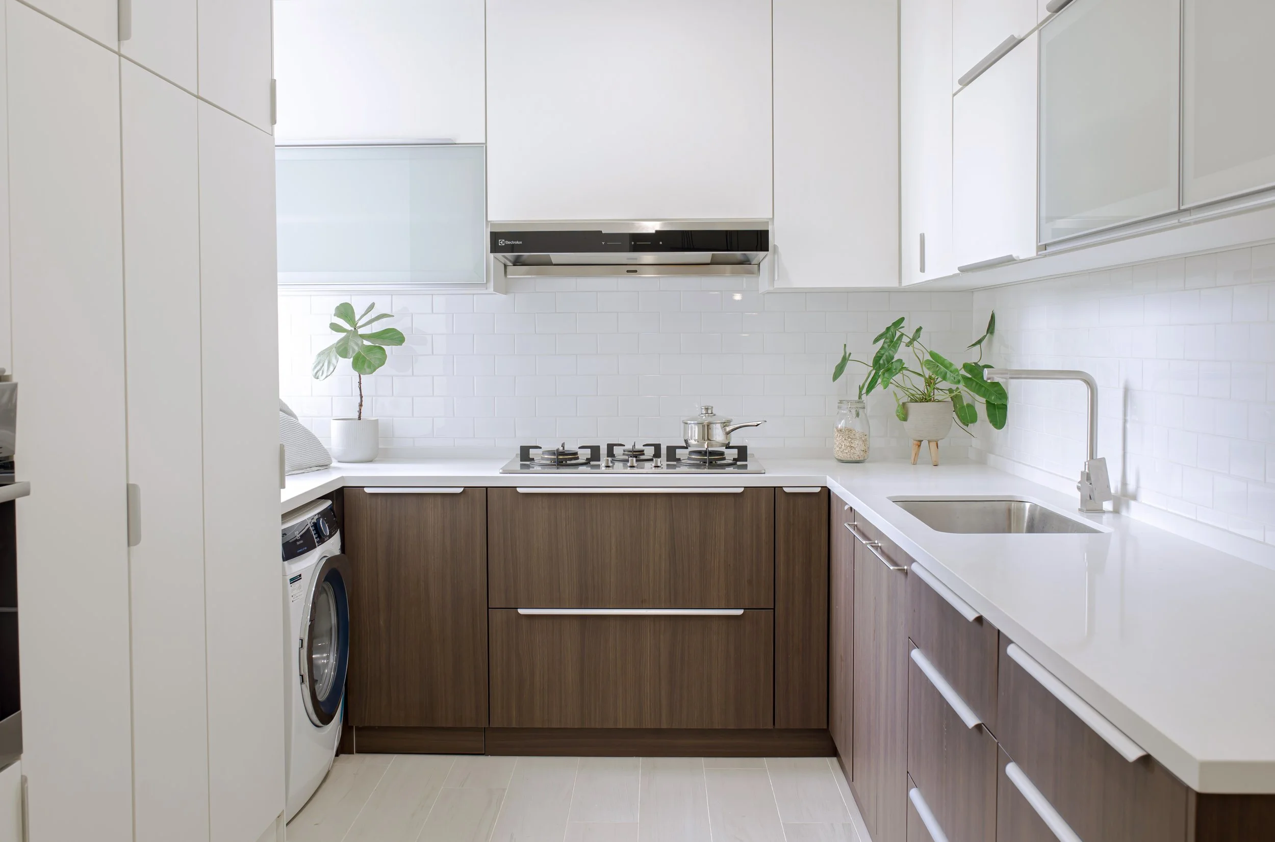
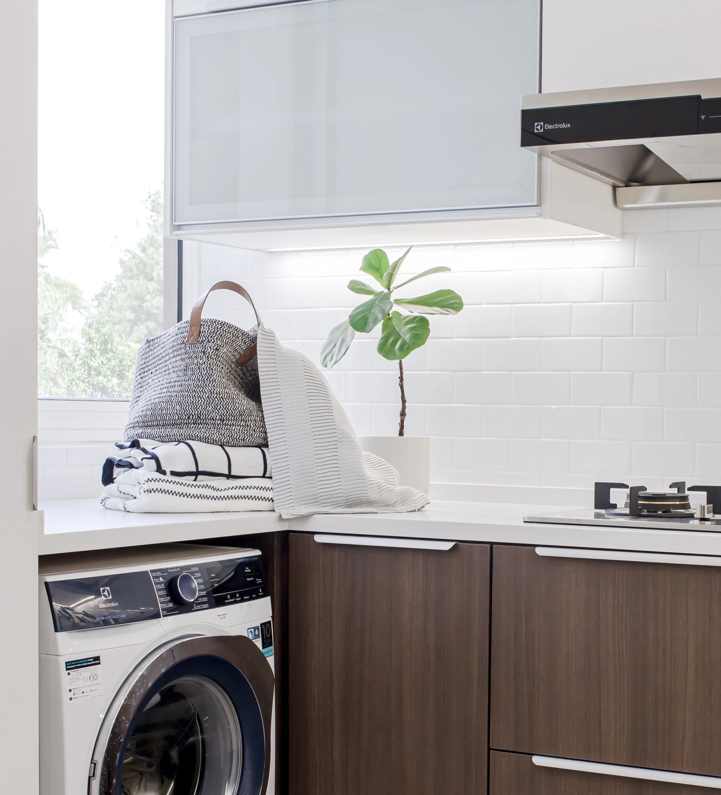
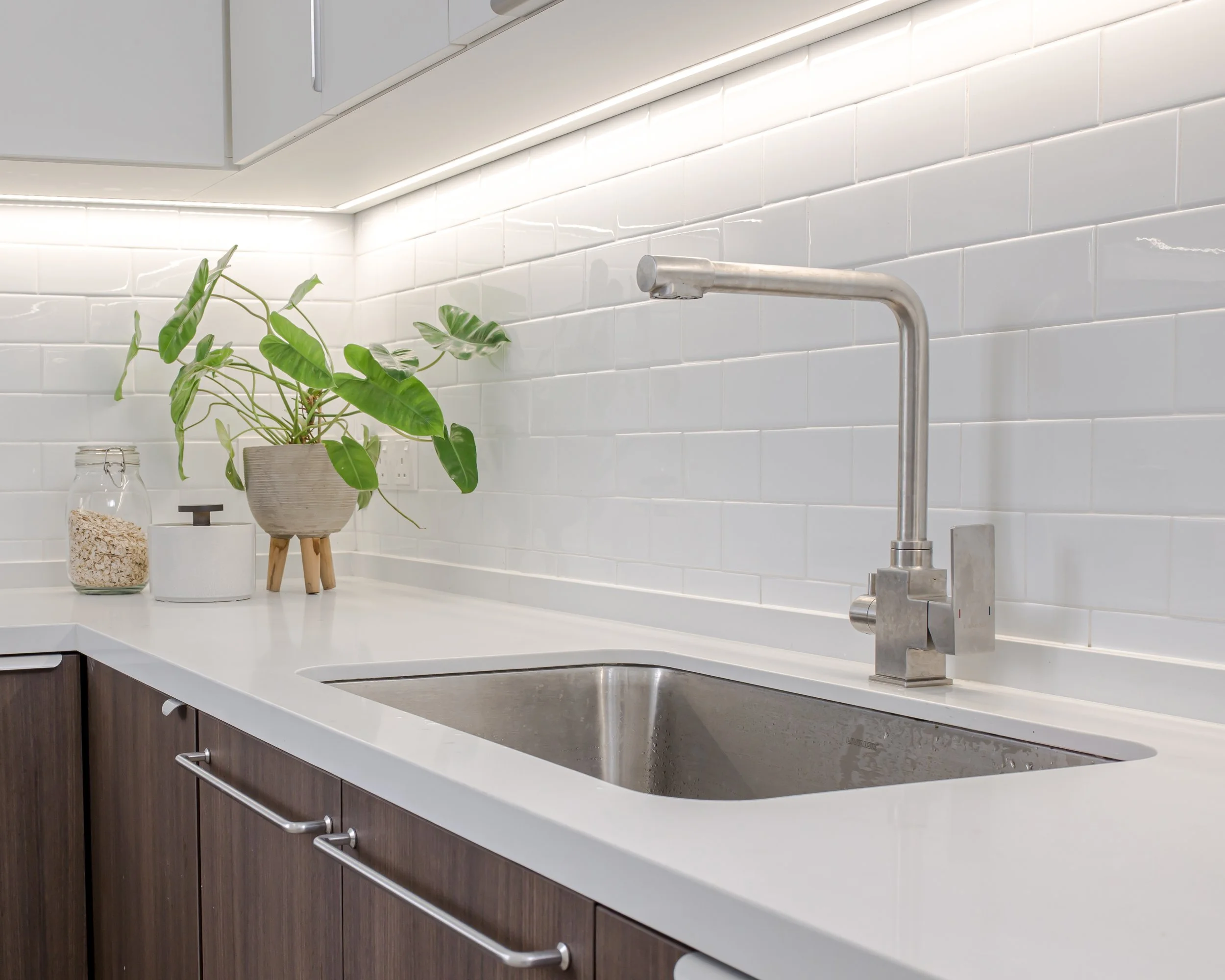
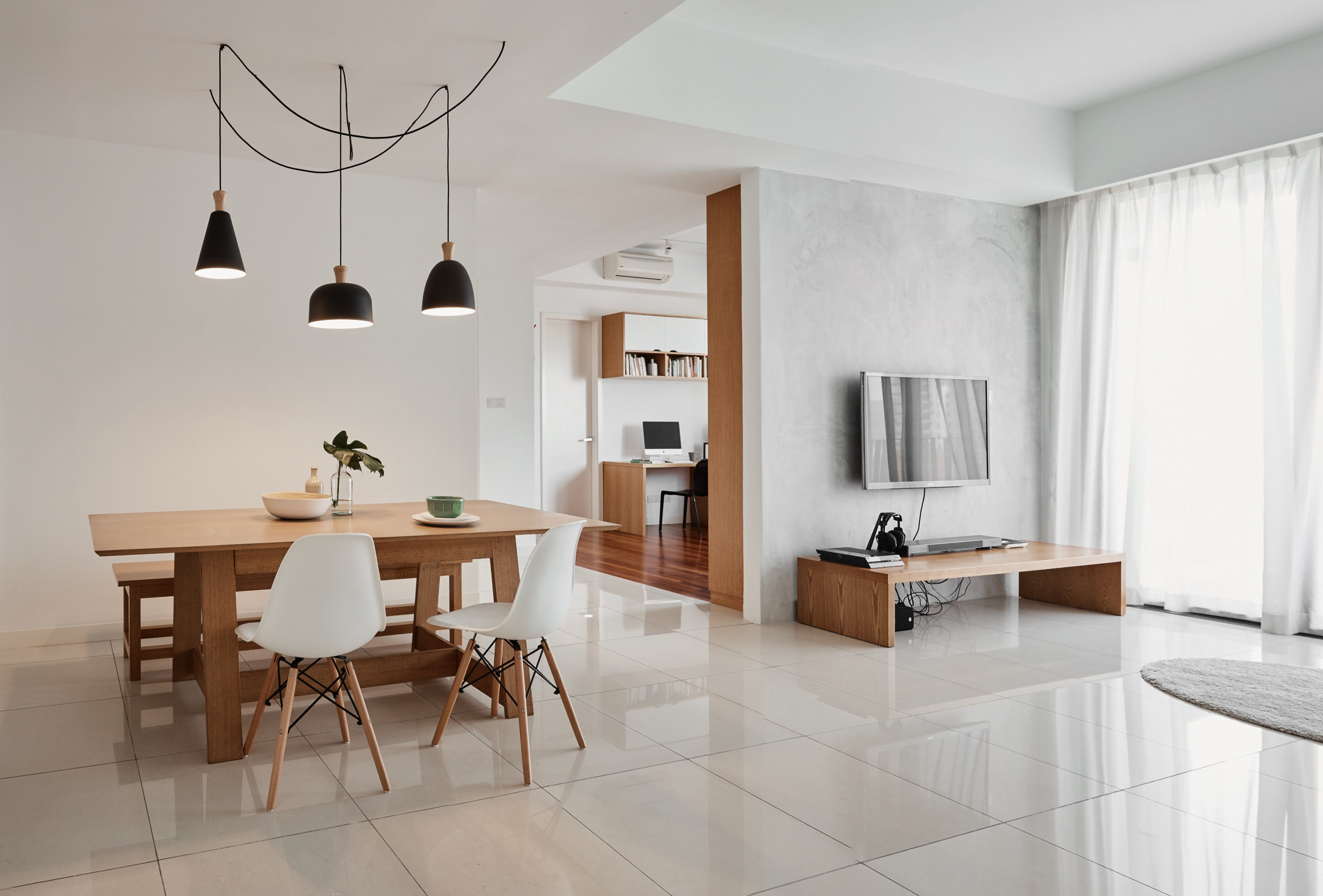
This design project is conceived as a calm, light-filled space that prioritises natural light, simplicity, and connection to nature. Large openings and an open layout allow daylight to become a defining design element, creating an atmosphere that feels airy, warm, and inviting throughout the day.
A neutral and restrained material palette anchors the space, emphasising clean lines and understated finishes to maintain a sense of clarity and balance. Natural textures and subtle organic elements are introduced to soften the minimal aesthetic and strengthen the connection between the interior and its surroundings.
At the heart of the design is a communal table that functions as both a gathering point and a flexible work surface. This central element encourages interaction, collaboration, and shared use, blurring the boundary between social and functional space. The result is an environment that feels timeless, adaptable, and quietly refined—supporting both social and productivity in a serene, nature-inspired setting.
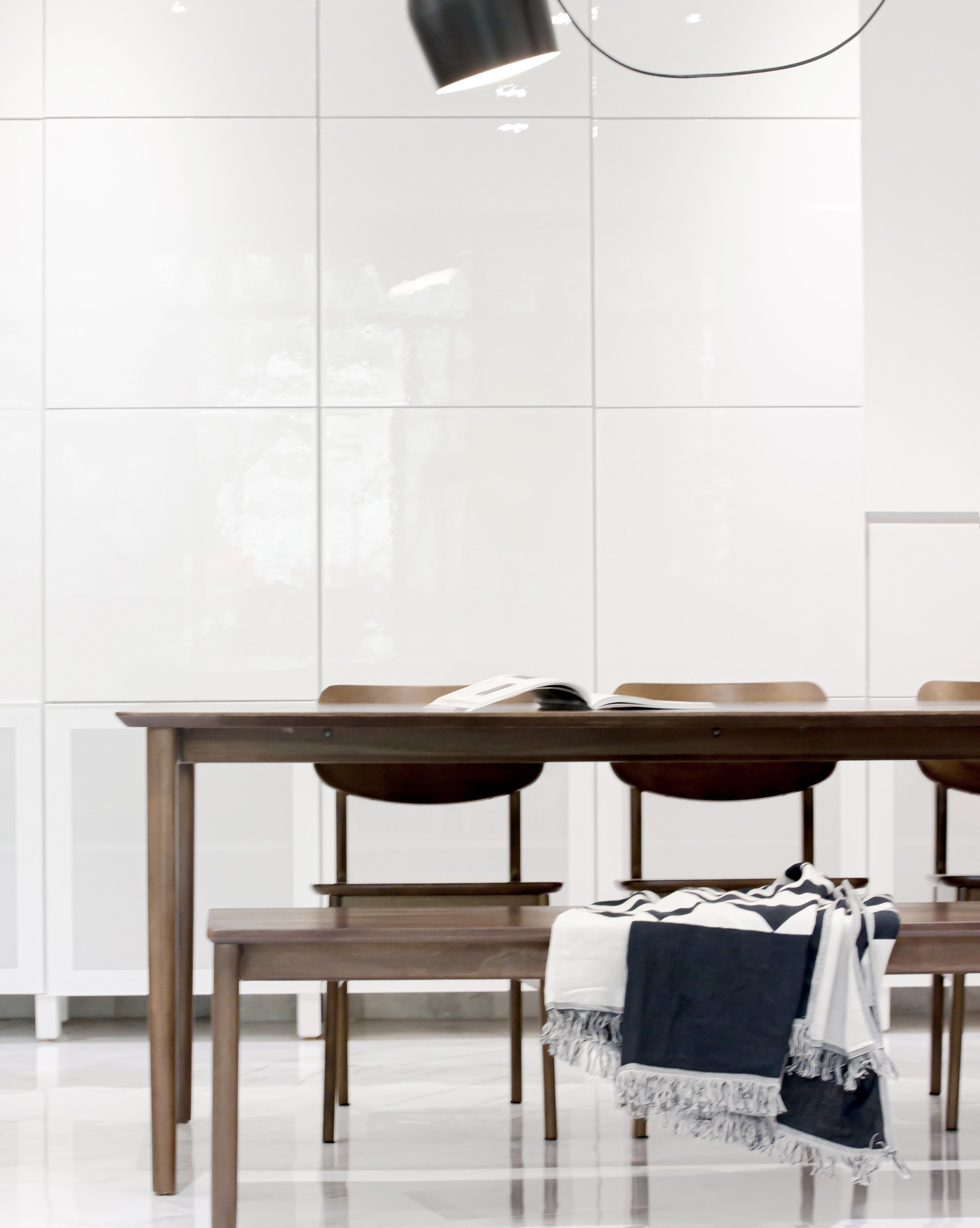
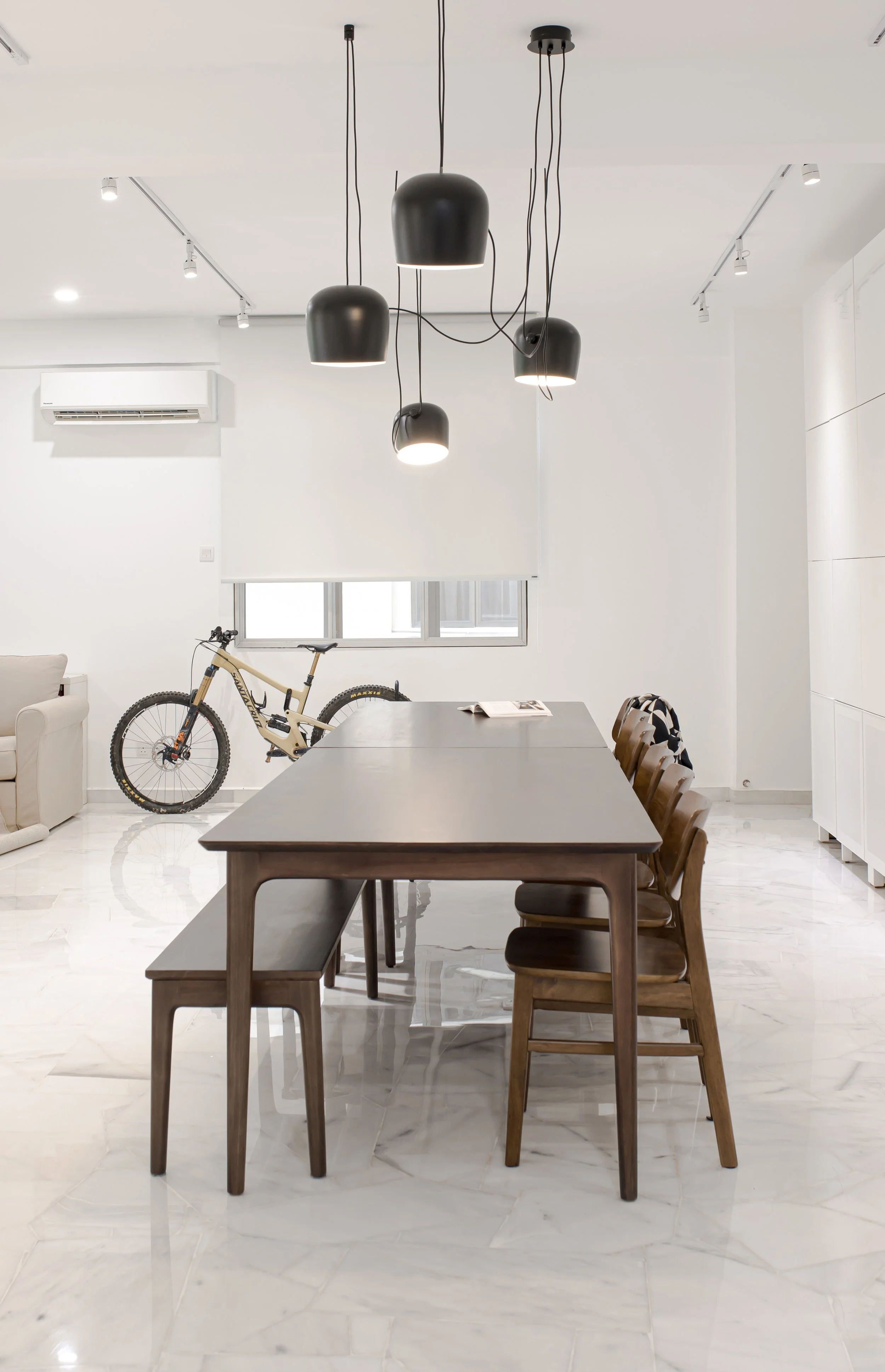
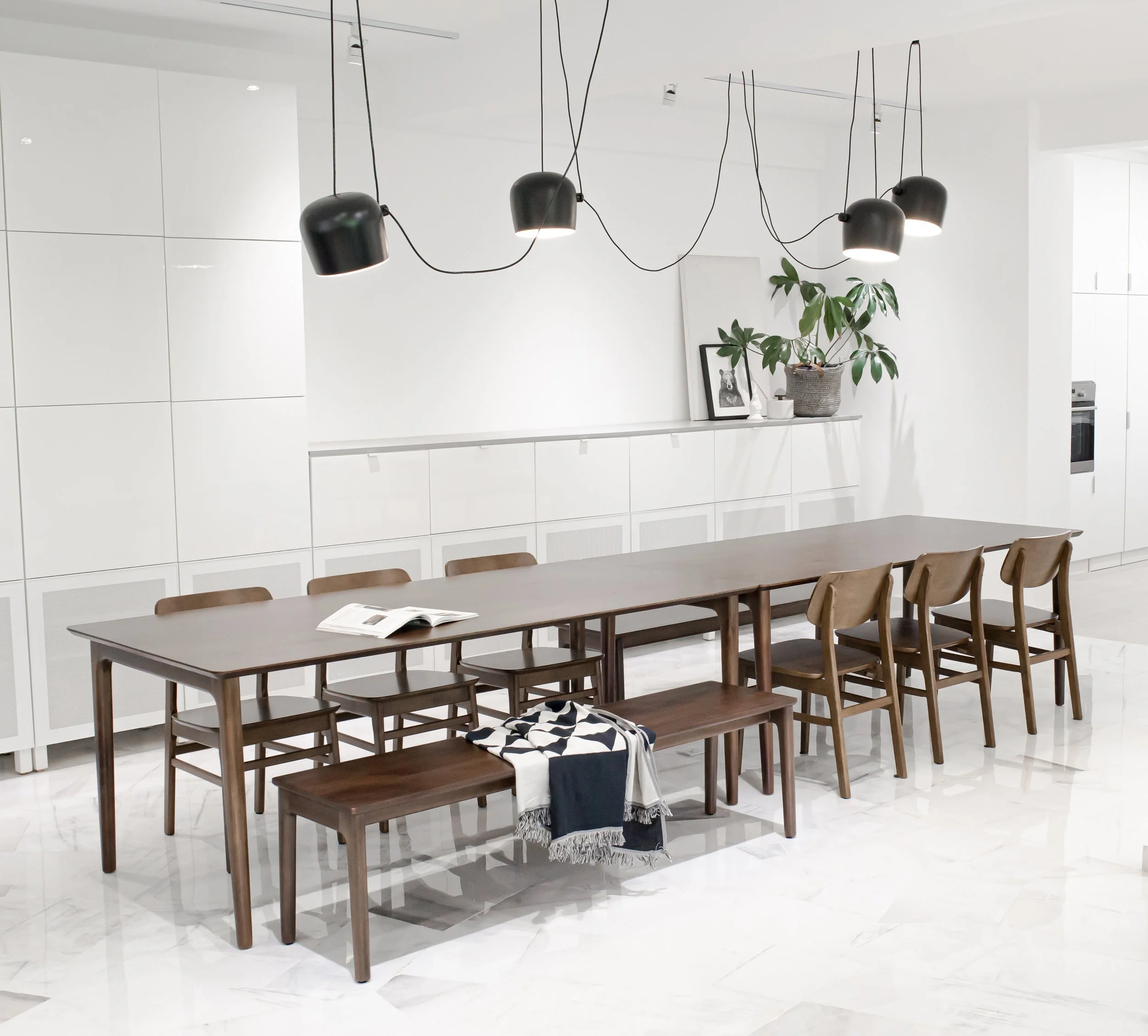
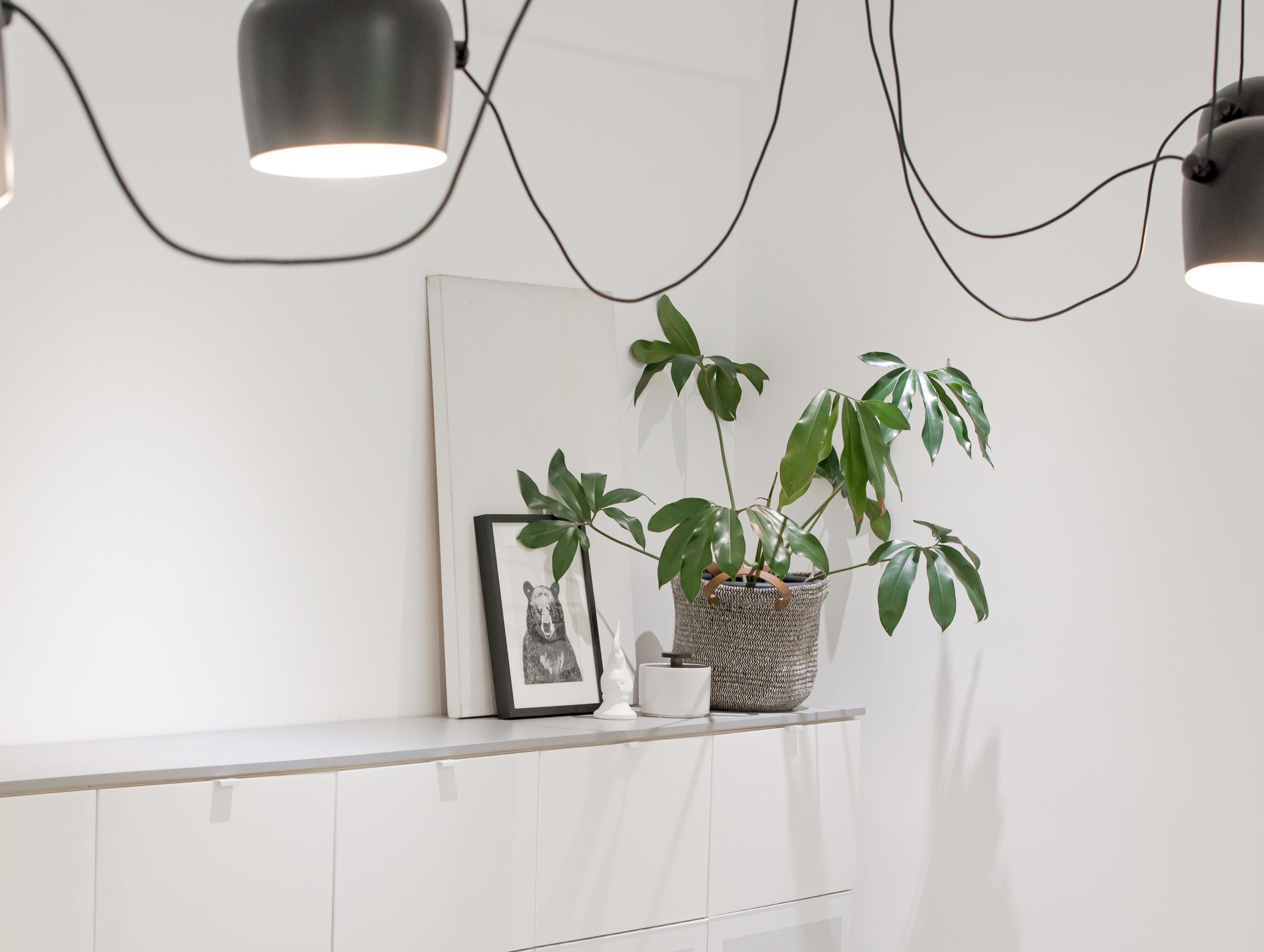
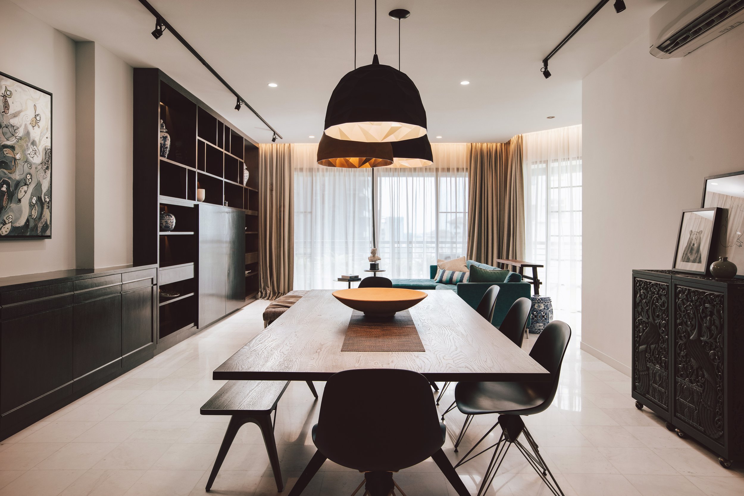
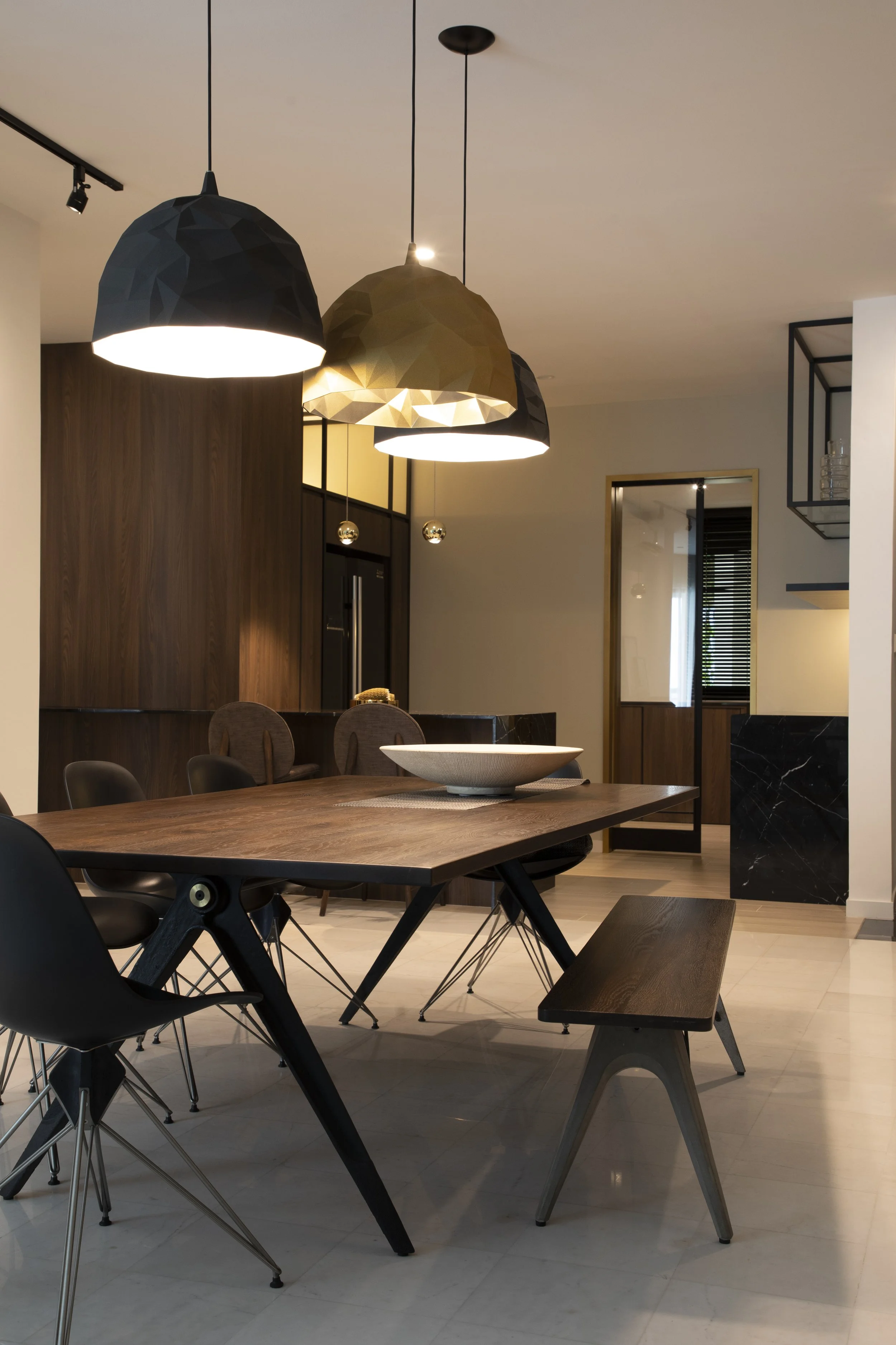
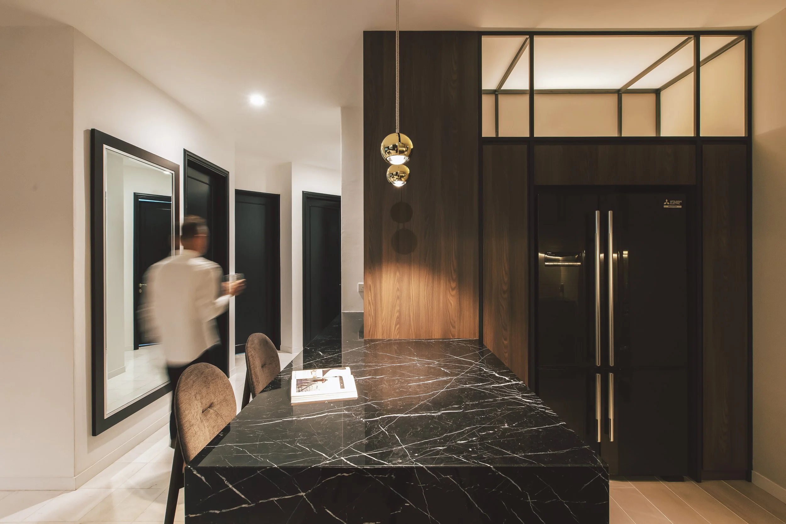
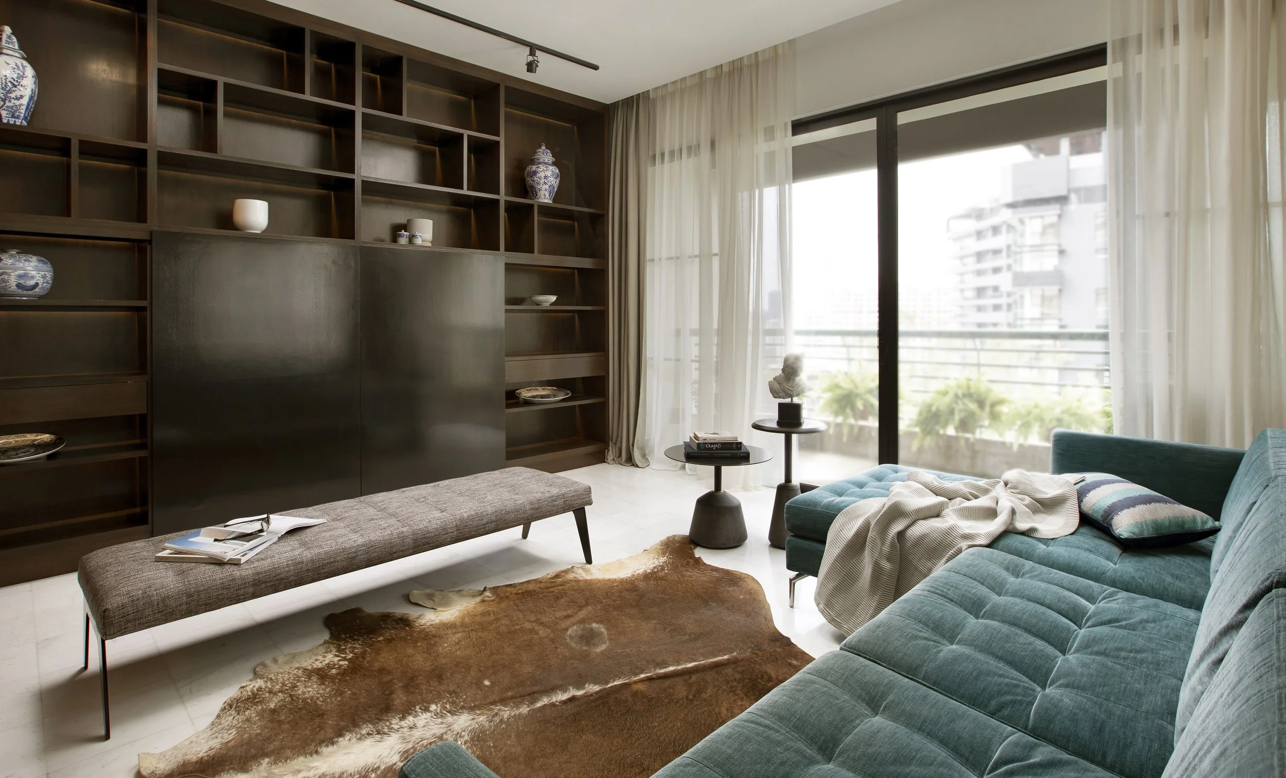
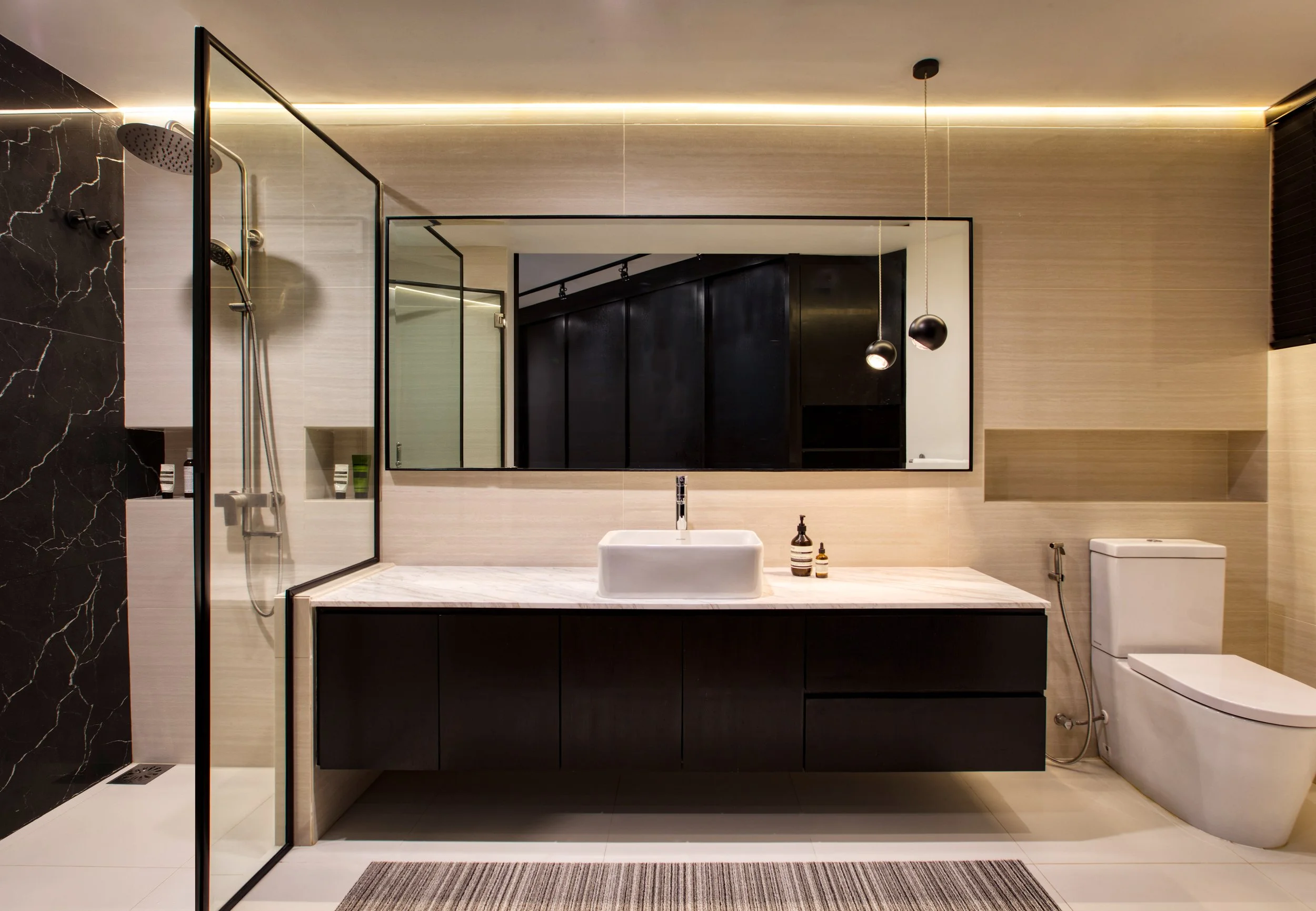
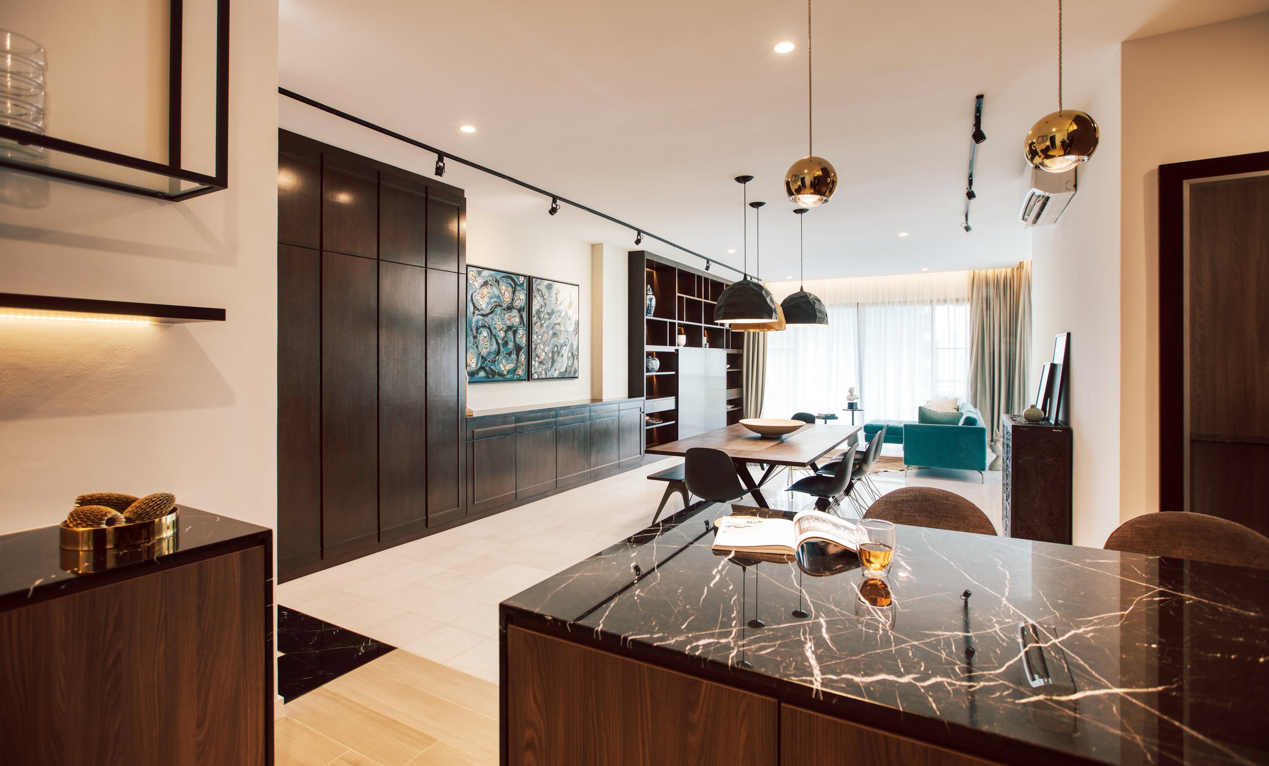
A client hails from the hotel industry. With that, came pressure to make the space “hotel worthy”, yet homely.
Rich colour palettes were used to accentuate the feeling of comfort. From the dark, rich, wood of the cabinets and tables to the space’s many gold accents.
The dining room lights became a particular favourite.
A demanding project that required numerous discussions over wine, along with a helping of trust and laughs.
The keyword of the project was “transformation”
Started as a two storey terrace house. A little run down, rough in all the wrong places. Ended up as a three storey hoe iwht a wide open top floor, suitable for yoga sessions or a home office, A challenge during the year 2020.
Modernity, spliced with black and white tones. Minimal, bold yet welcoming.
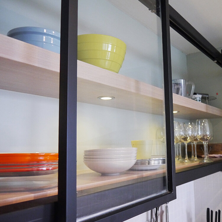
The project started with just the basics needed. As the relationship between client and designer flourished as did the kitchen grew and the space was personalised.
A young couple that is both filial and pious but want to break away from traditions. A kitchen big enough for the whole extended family to make dumplings together but yet not an expected colour. A slider to separate the kitchen yet allows are air and light through. A sense of zen throughout the house that was carried through even to their altar for prayers. A design for a non-traditional couple who knows exactly where their heart is.
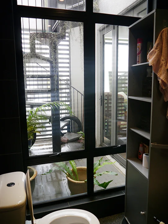
Being the first home, the idea was to make it exactly that. A design that brings back childhood memories with retro windows, and back to basics unfinished concrete renderings. A design that realises the adult dream of having a walk-in-wardrobe connected to an open bathroom. A grown up home nestled in a childhood memory. A house that became an oukka, the one that paved the path for Oukka Design.
“Black, white and a hint of wood.”
Words that implied simplicity, focus and precision.
Words that went beyond a colour scheme, informing every aspect of the space. From the tilt angle of the lights, to the lines and blocking of the space. Every corner was crafted, every angle was aligned. The space also accounted for future family additions.
Designed to match the taste of ones who designed for a living.
This house did not only have the luxury of space but also of natural light. It was easy to focus on this two strengths to give the house a homely yet luxurious feel.
The brief revolved around light and a sense of openness. However, the restrictions of a condominium posed some challenges. But after the dust settled, the fuss of taking down of walls and rearrangement of doors paid off when natural light was able to reach every hidden corner of the unit. The light colour scheme opened up the space further, while the use of wood brought warmth and natural comfort.
They were young, fun and expecting an addition to the family. And since they needed to juggle all that, the spaces had to pull double duty. A counter that was also a bar and a breakfast table. A living room that was also an open playpen. Spaces that felt cozy like a home, yet able to accommodate the lively gathering of friends and family.
A fresh start.
A sentiment that also became the basis for the spatial redesign of the owner’s current living space. A rearrangement of the furniture, and a carefully chosen colour palette brought much needed life to the living area. The refurbished kitchen allowed the owner to rediscover the joy of cooking.
It was a reboot for both the home, and its owner.
The brief called for a weekend getaway space, but it quickly become the permanent home.
A larger space was made to accomodate the kitchen for those delicious cookouts, while still retaining a sociable dining area. For quieter weekends, there’s a reading corner just for just them and their favourite book. Floor to ceiling shelves made use of the high ceilings, and gave the space more personality. The result retained the freedom of a weekend villa, along with the comfort and familiarity of a home.
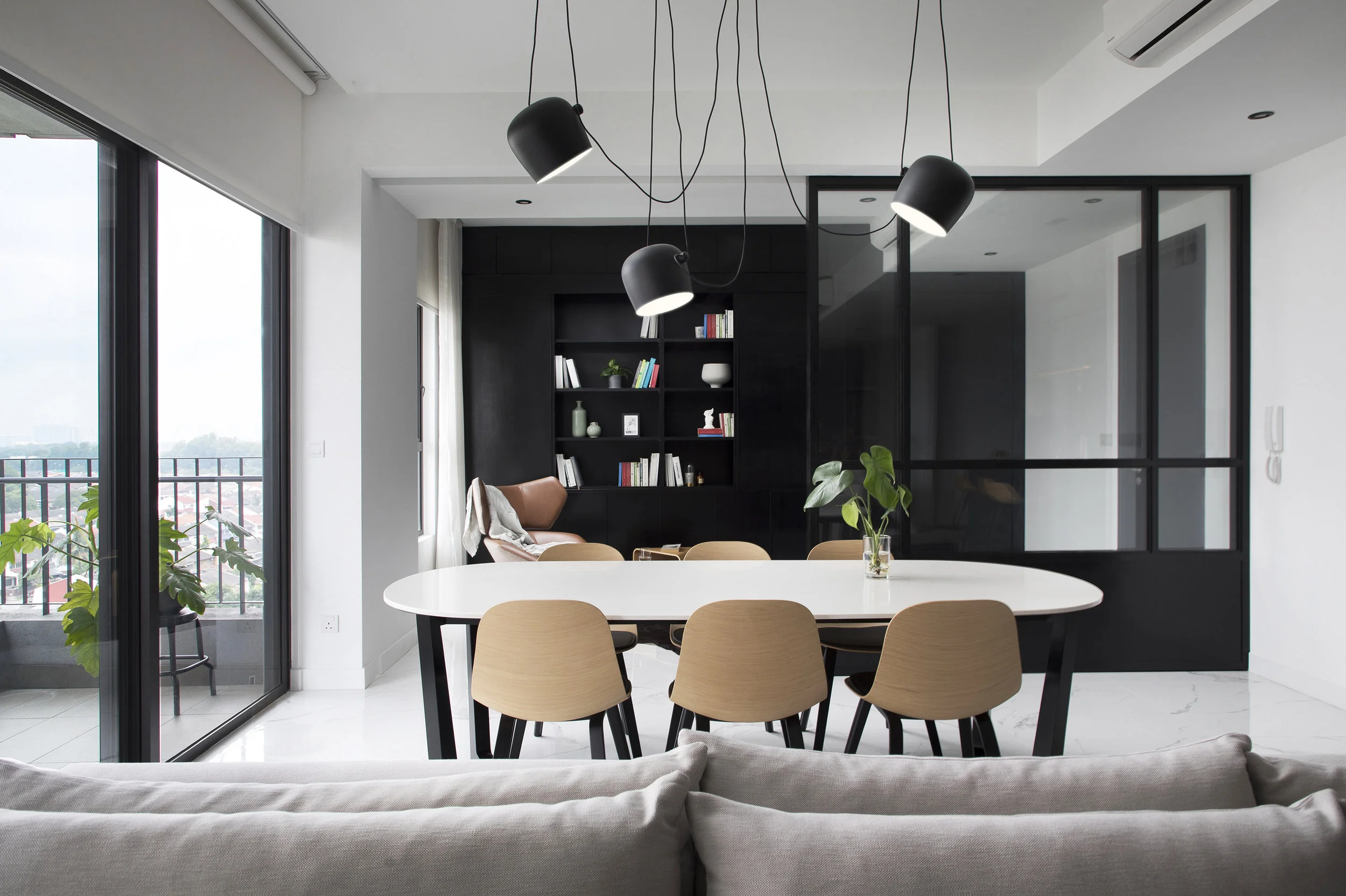
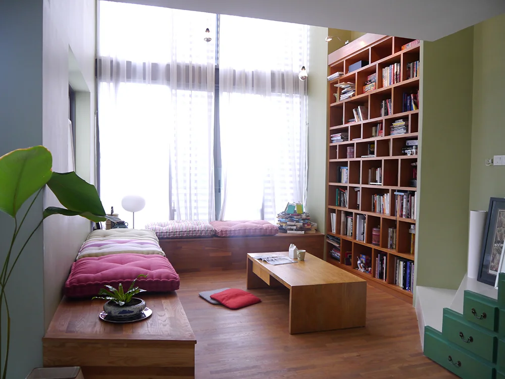
Eclectic.
There is a story in every corner on every wall. From the living room to the study area, nothing is fixed. Furnitures can be rearranged and redecorated whenever there is a need to do so. Bookshelves can be restacked and routines can be broken.
Never a dull moment in this home.
A project that was really four projects in itself. A russian doll of spaces, each room and corner different from the one before, bringing a little more delight than the last. An eclectic mix by design, reflecting the artistic, out of the box sensibilities of the owner.